Streamline Web-Development with Bulma CSS Framework
Table of Contents
Recommended basics: Articles you should know
To get the full picture of this article, you should know about this topics:
You may also want to use the content map to find interesting articles that play into this one.
Even if I have creative ideas, I’m not a designer. I just do not enjoy it enough. So I search for how to achieve my ideas without the need for me to design my stuff myself. If you are in the same position, you will like to hear about CSS Frameworks. In this post you will get in touch with Bulma.
You will see how to switch from a custom about me page implementation to an improved version using Bulma in no time.
How to install Bulma #
You can just visit the Bulma website and click the download button. If you like, there’s an extended documentation about multiple ways how to install Bulma.
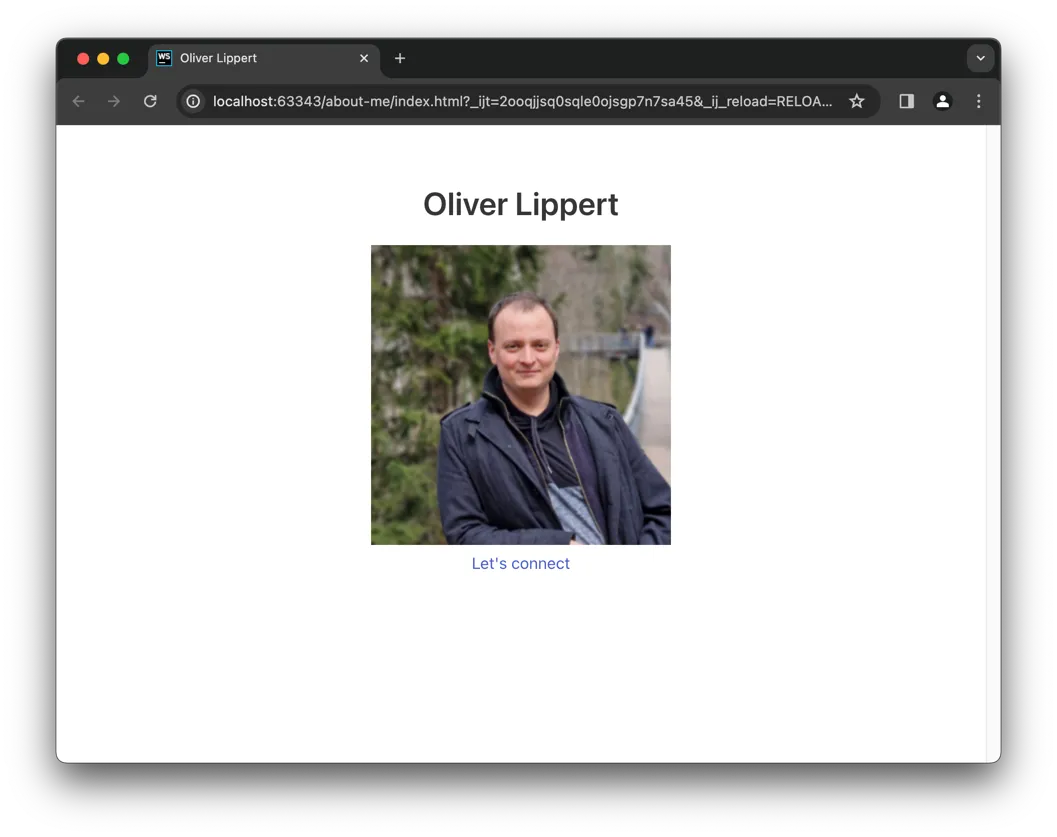
Finally you need to add Bulma in your project, you can just copy the bulma folder into your project. In
the about me page it would look like this:
| |
Integrating Bulma into the page #
Right now nothing changed. For now this is expected, since we did move Bulma to the correct position but still we do not reference it.

Bulma comes with a CSS file that we need to reference to make bulma work. Also it’s recommended to add two other header information:
| |
First we do inform the browser that our file encoding is utf-8 (should be standard nowadays). Also we configure
the viewport, so we tell the browser that our page’s width
should follow the width of the device and that initially the page should not be zoomed. Lastly we reference Bulma’s
CSS file, this will include Bulma in our page:
As you can see, there are some, but not many changes. You know what?: That’s expected. Remember:
Whatever you add to your project, without your support it will not change the world for you.
So let’s move on to get the first benefits from Bulma.
Enhancing Style: Migrating from Custom CSS to Bulma Framework #
Let’s challenge Bulma by replacing our custom CSS implementation with a Bulma-only version.
Go ahead and delete the style.css file and it’s reference from head section in your HTML. Finally your
files and HTML should look like this:
| |
| |
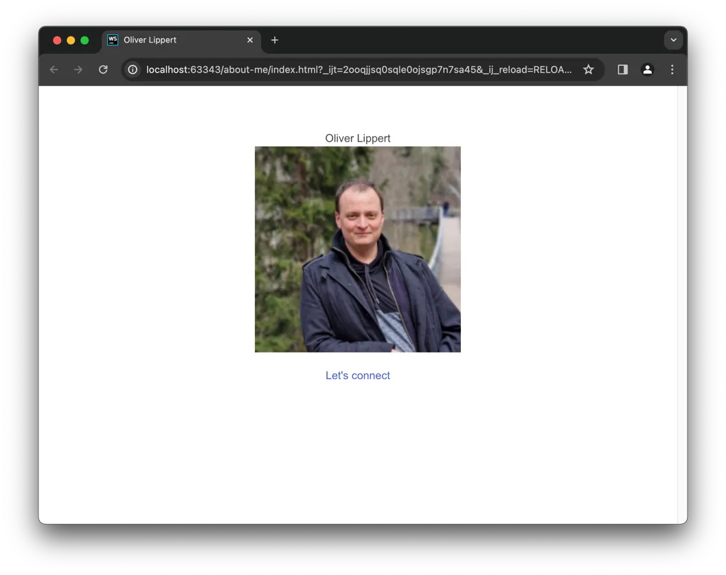
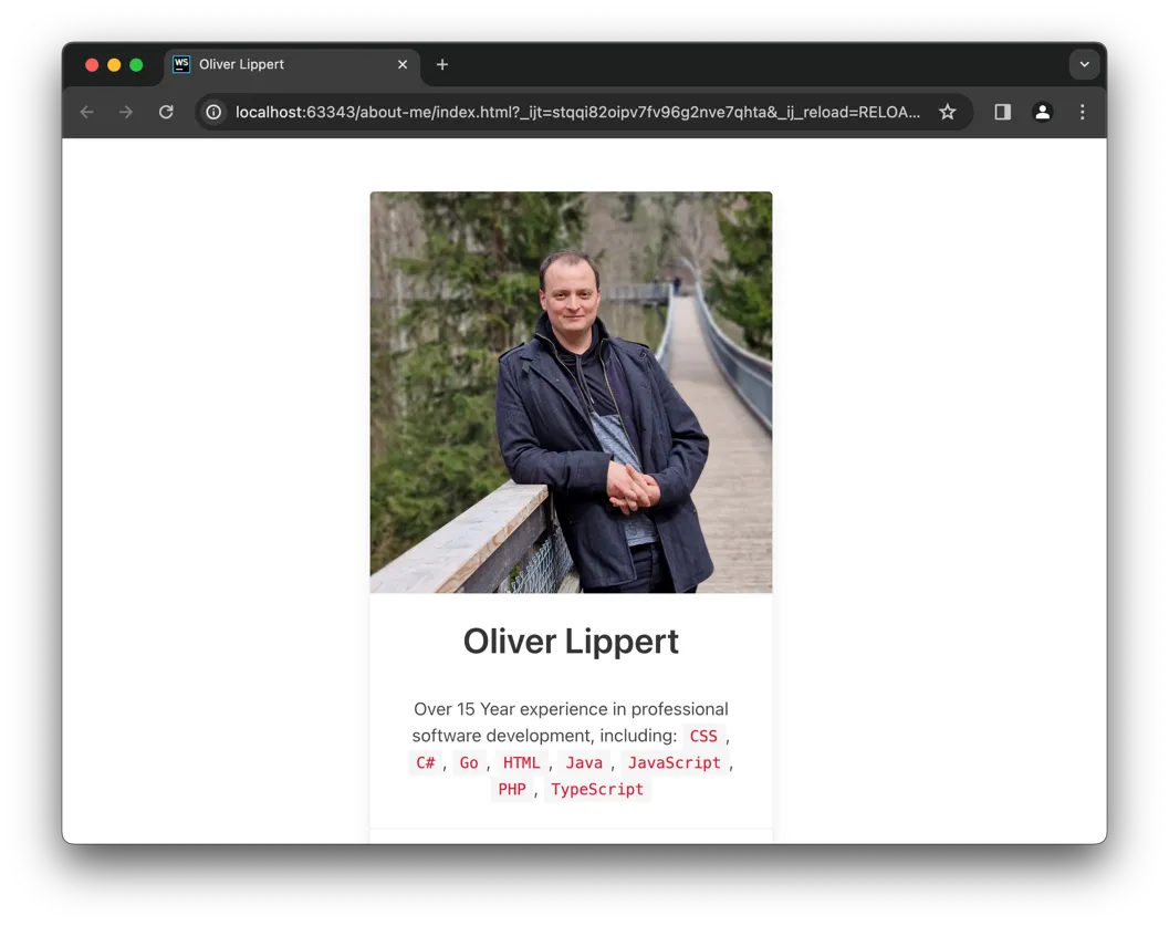
At this point, your page should look like this:
Gladly we can fix this with a few tweaks. Such CSS frameworks often work with CSS classes that you add to existing or new
elements. The frameworks mostly just target such elements and do not touch others.
Centering Your Content for a Polished Look #
We wanted to have the content being centered. We achieve this by wrapping our elements inside the body into a div
with the following classes: columns is-mobile is-centered mt-6.
| |
You can read more in the Bulma documentation, here’s a very short description:
columnsdefines, that all elements inside the current one are lined up next to each other.is-mobileprevents them from splitting up even on small screens (probably mostly needed for my screenshots).is-centereddefines, that allcolumn’s inside should be centered.mt-6adds some top margin.
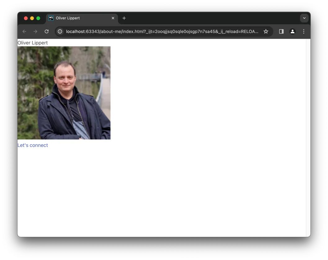
But now we have all items in one line, we don’t want that. That is because inside columns wrapper there should be
just column elements, not the content itself. So let’s fix that:
| |
Again let me give a short description:
columndefines the element as a column for the grid system. The basic idea is that you split up the display width in some amount of columns. Each defined column can then define how much columns width it is using. As long as there’s free room, the grid system will line up columns next to each other.is-halfdefines, that this column should use the space of half of available columns.has-text-centereddefines, that all text inside should be centered.
Probably this looks complicated right now, but stick to me, it’s worth it.
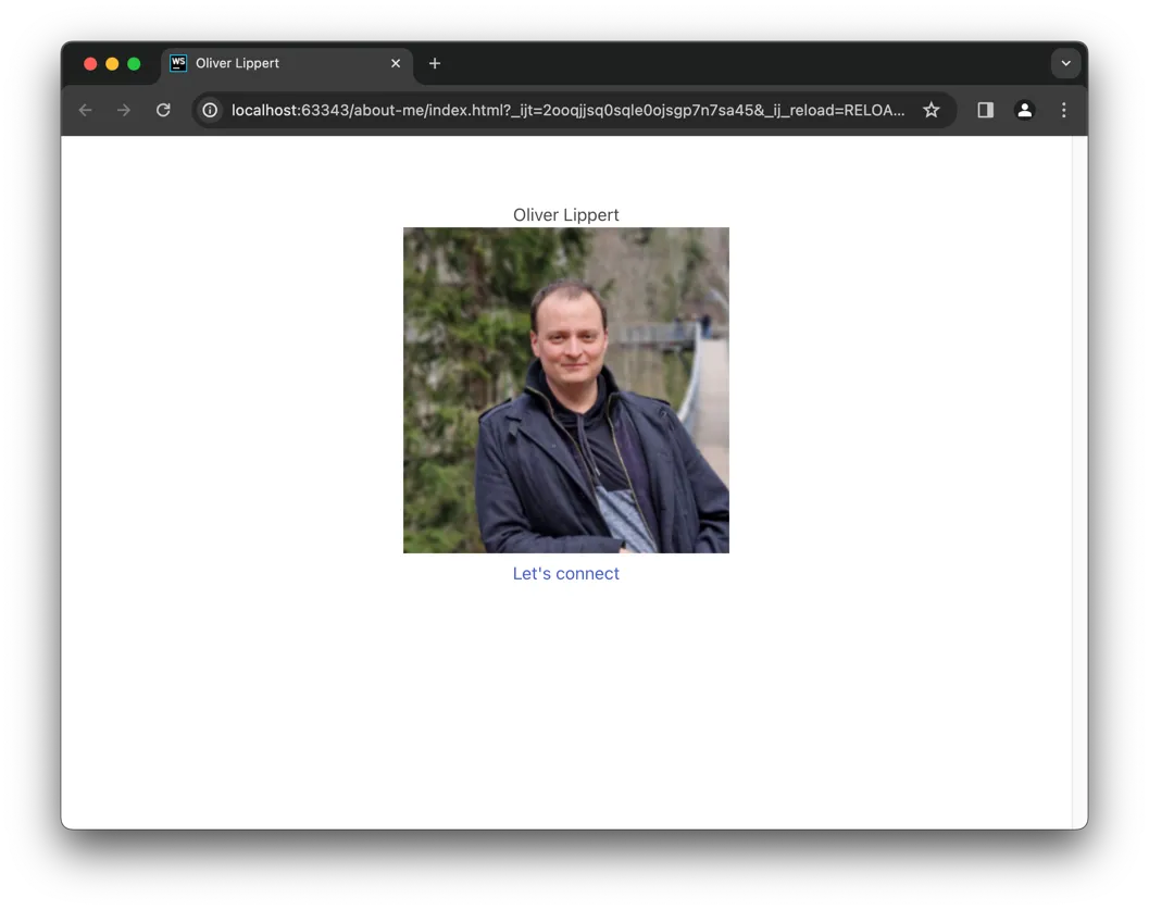
Reviving Impactful Headlines with Bulma #
As you probably saw, the headline is not shown as such any longer. It will look nice again after adding the title
class to it:
| |
Transforming Square to Circle: Enhancing Your Image with Bulma #
Let’s get the first benefit by rounding the square image, wrap and modify the img like this:
| |
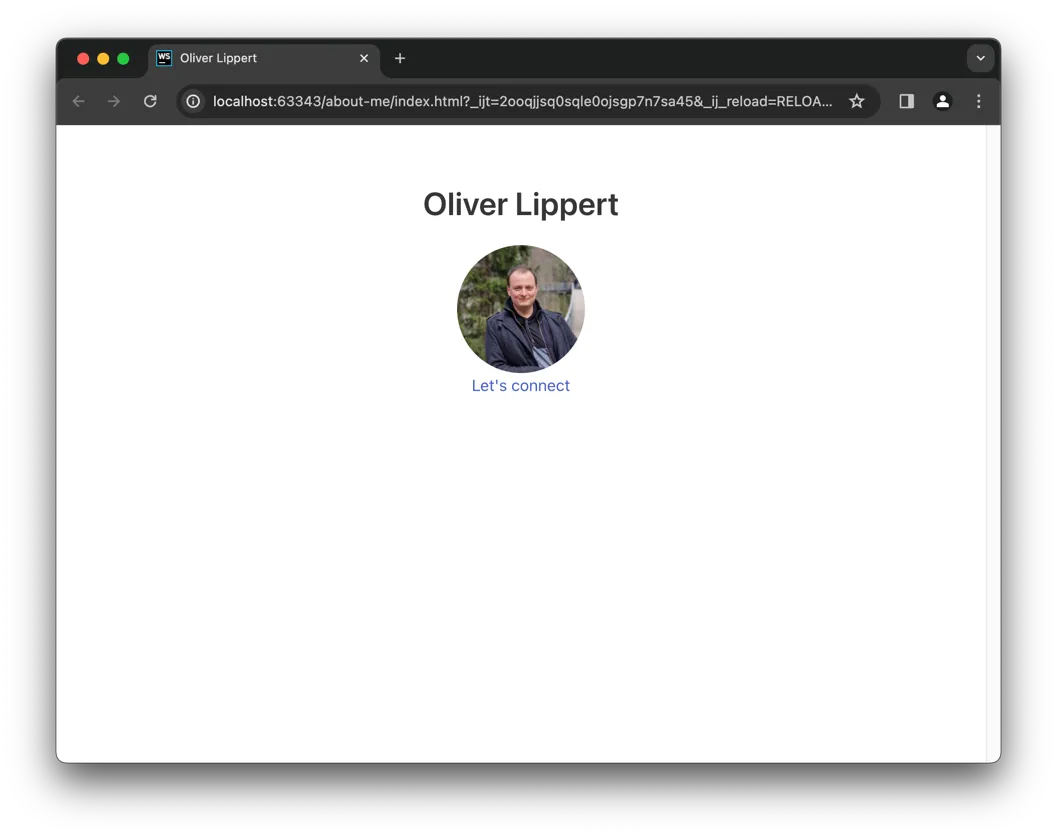
Let’s break down the changes:
figureis a HTML element to wrap media files (like images) which can optionally have a caption for the image as well. Feel free to read more about the figure HTML element.imagedefines, that this figure will wrap an image.containerwill center the element.is-128x128will set the image size to 128 px * 128 px.- As you can see also we add
is-roundedto theimg, this finally transforms the square image to a round one.
Elevate Interaction: Implementing a Sleek and Engaging Button Design #
While it’s nice to ask users to connect, it’s to “decent” right now. Add this attribute to your a link:
class="button is-primary mt-5":
| |
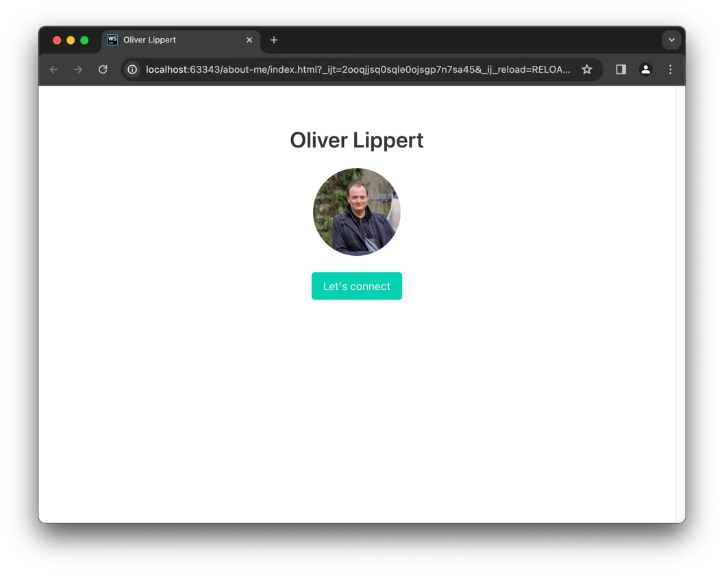
Here’s what happened:
buttonadds the button style to the link.is-primarydefines that the button should be styled as a primary button.mt-5adds some top margin.
Unveiling Bulma’s Design Elements: A Comprehensive Overview #
Bulma has multiple elements and components. Keep in mind: There’s a documentation for bulma.
Let’s walk through a short list of things I would use every now and then.
Mastering Responsive Layouts with Bulma Columns #
I mentioned bulma columns already briefly. It’s basically just
a wrapper (usually called row) which holds one or more elements (usually called collumn) and takes control
about when to show them in a row and when to split them up into “each on it’s own row”.
columns on the other hand can define if they have a flexible width or specify a width in amount of columns.
See a nice visualisation of column widths in Bulma’s documentation.
Once you have done it a few times, you’ll get used to it. The challenging part is (at least for me) always the same: Thinking about how many columns do I use and how wide they should be.
This row / column idea is very important when we talk about responsive design. A column can have multiple width’s assigned based on the available screen width. This way you can have a single HTML code serving various screen sizes. So again: It’s worth diving deeper.
Elevate Design with Bulma’s Box Element #
Using Bulma’s Box element you can draw a shadow around other elements. You can use this to highlight a special section in your page. For example a “subscribe to newsletter” banner or so.
Visualizing Progress: Harnessing Bulma’s Progress Bar Styling #
If you ever need to show the user some progress, Bulma styles progress bars as well.
What I really like is it just asks you to add a progress class to
HTMLs default progress element.
There’s multiple styling and sizing options, but basically it’s just adding this one class. Easy.
Elevate Visual Appeal with Bulma Cards #
If your project has to do with blog posts or so, you probably are interested in Bulma Cards. It can combine image, author, text and date in a “typical” format. On the other hand it’s very dynamic, you you can use it for other content as well, the documentation shows up some examples.
Transforming Your Profile: Content Enhancements with Bulma #
This was a lot of theory, so let’s get in some practice. You started adding Bulma to your About Me page already, now let’s enhance the page with some more content and features.
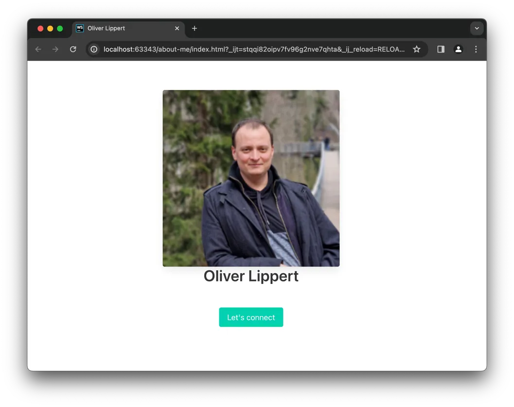
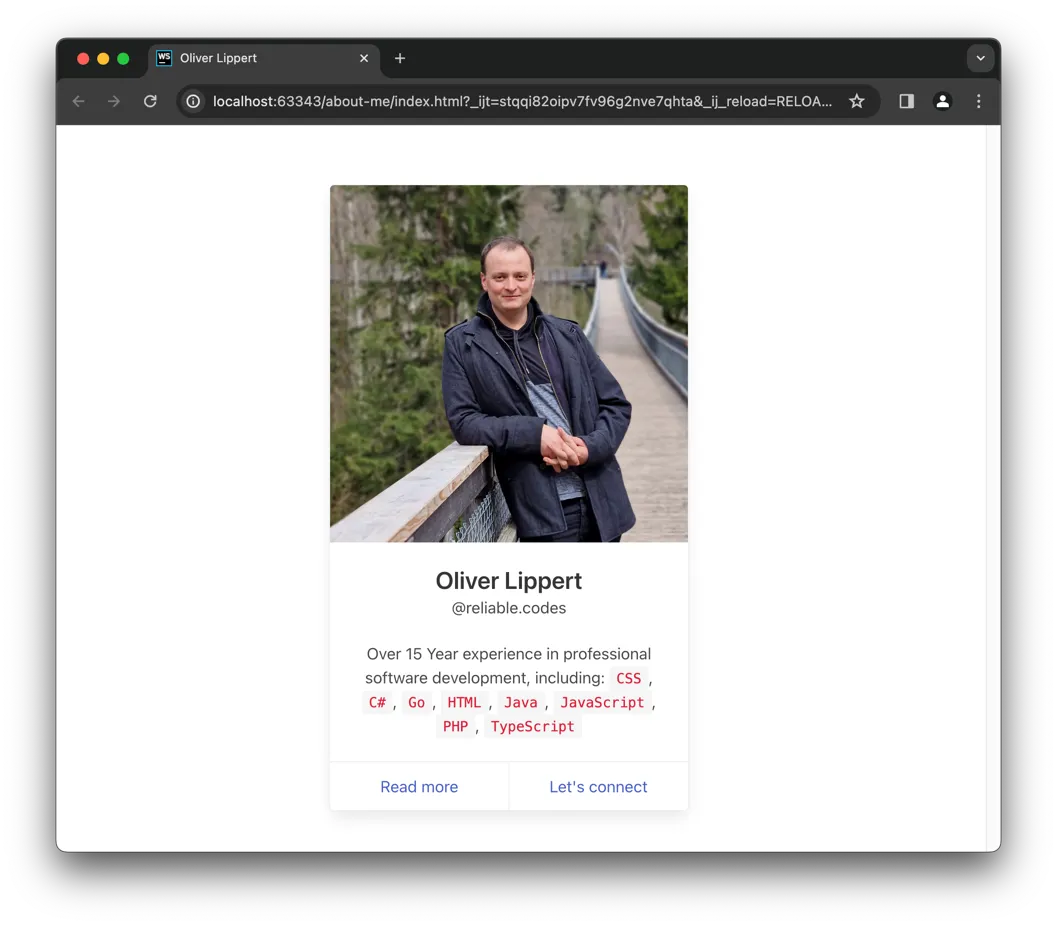
Elevate Your Design: Seamless Transition to a Stylish Card Layout #
Your layout is close to a card already so it just makes sense to “migrate”. Since the card will use all available
width, you start by rescaling your current column to is-two-fifths.
Now you can start adding the card to the column. I would suggest you do not change the current content right now, but just add the card on top of the column:
| |
Now let’s move your image into the card:
| |
First step done, so now let’s move the name and the link into the card as well. For the name it means
- adding a
card-contentafter thecard-image, - put a
contentinside and - write your
titlein there
| |
The link that you currently have as a button, can be integrated as a footer element with the class card-footer,
simply move the a into the footer and you’re done.
| |
This should end up in your HTML code looking like this:
| |
Finally, let’s extend the content slightly, so visitors do understand better who we are. You could go with some technology keywords after your name:
| |
And also you probably want to push my social handle a little more, so you can
- add a
mediaelement beforecontent - add a
media-contentelement intomedia - move your
titleout ofcontentinto themedia-content - add the class
is-4to yourtitle - add a new
pafter yourtitlewith the classessubtitle is-6 - write your handle inside this
subtitle
| |
And since you probably have another platform than LinkedIn, let’s add another link in the footer for further details
| |
So far you have achieved two things:
- Thanks to Bulma, you dont maintain so much CSS Code yourself
- Thanks to Bulma, you have new ideas and new implementation possibilities
Quantify Your Experience: Showcasing Key Metrics for Professional Impact #
I think there is some key points which help to understand better who you are. I would say it’s worth highlighting
- Years of experience
- How many projects you worked on
- How many technologies you worked with
Add another column after the current one:
| |
And inside, for those three topics, place this “template” (for sure you need to modify it):
| |
Over all it will look like this:
| |
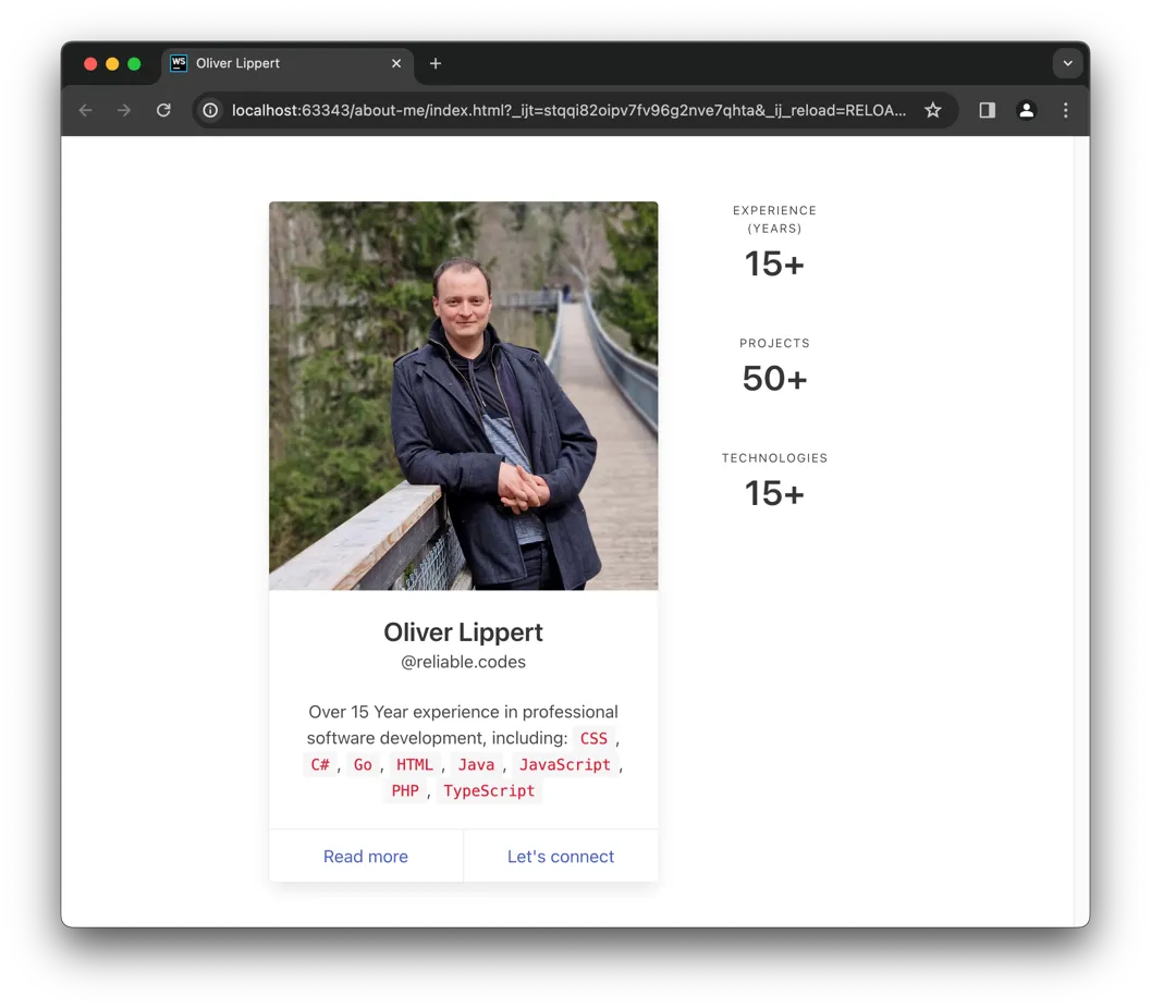
See how easy you can achieve your goal by thinking of what you want to do and then using a framework to get it done?
Key Takeaways: Mastering Bulma and Streamlining Web Development #
As you can see in this post, things start connect to each other. Knowing (at least basically) HTML and CSS was a key and enables you to understand and using complexer things like a CSS framework. Working with complex projects from within an IDE is helpful.
Please also recognize how I break down the big idea into simple, small and moreover testable baby steps. Personally I like to work this way, since I have a good feeling after every step and I can move on with good confidence to finish what I want to do.
Keep pushing forward: Next articles to improve your skills
With this article in mind, you can keep on reading about these topics:
You may also want to use the content map to find your next article.